
- The LinkedIn banner size is 1584 x 396 pixels for a personal profile, a 4:1 ratio, JPG or PNG, maximum 8 MB.
- A Company Page cover image is 1512 x 256 pixels, PNG or JPEG, maximum 3 MB. The 1128 x 191 figure most guides still print is an older spec.
- Keep text and logos inside x 420 to 1524 and y 60 to 336. The profile photo covers the lower left corner.
- Export at exactly 1584 x 396. Upscaling a smaller file is the most common cause of a blurry banner.
- A strong profile is the front end of outbound, which is what Reachly's LinkedIn ghostwriting service is built around.
The LinkedIn banner size is 1584 x 396 pixels for a personal profile and 1512 x 256 pixels for a Company Page cover image. Both numbers come from LinkedIn's own image specifications. A profile background photo accepts a JPG or PNG up to 8 MB. Every Company Page image accepts a PNG or JPEG up to 3 MB. Design at those exact dimensions, keep the important content inside the safe zone, and the banner renders sharp on desktop and mobile with nothing that matters cropped off.
TL;DR: Summary
- Personal profile banner: 1584 x 396 px, a 4:1 ratio, JPG or PNG, maximum 8 MB.
- Company Page cover: 1512 x 256 px, PNG or JPEG, maximum 3 MB. The 1128 x 191 figure that most size guides still print is an older spec.
- Keep text and logos between x 420 and x 1524, and y 60 and y 336. Your profile photo covers the lower left corner.
- Export at full size. Upscaling a smaller file is the single most common cause of a blurry banner.
- LinkedIn re-compresses every upload, so flat color and large type survive better than photographs and fine detail.
- One message per banner. A banner carrying three offers communicates none of them.
- The spec table below covers every LinkedIn image placement, not only the banner.
What is the correct LinkedIn banner size in 2026?
There are two answers because there are two different images, and they are not interchangeable. The image on your personal profile is called the background photo. The image across the top of a Company Page is called the cover image. They have different dimensions, different aspect ratios, and different file size limits.
| Placement | Dimensions | Aspect ratio | Max file size | Formats | Source |
|---|---|---|---|---|---|
| Personal profile background photo | 1584 x 396 px | 4:1 | 8 MB | JPG, PNG | LinkedIn Help |
| Company Page cover image | 1512 x 256 px | 5.9:1 | 3 MB | PNG, JPEG | LinkedIn Help |
Drawn to the same scale, the difference is obvious. The Company Page cover is a far shallower strip, which is why a personal banner design pasted onto a Page loses its top and bottom.
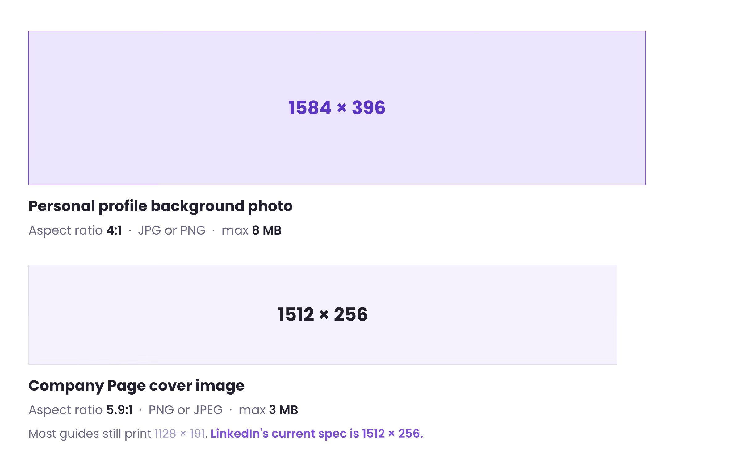
One number is worth calling out. Most LinkedIn size guides still list the Company Page cover as 1128 x 191 pixels, and at the time of writing Google's own AI Overview repeats it. LinkedIn's current image specification page lists 1512 x 256 as both the minimum and the recommended size. If you built a Page cover from a guide published before the change, it is being upscaled.
What are the LinkedIn image sizes for every other placement?
The banner is one of seven images LinkedIn specifies for profiles and Pages. Every figure below comes from LinkedIn's help documentation rather than a third-party guide, because the third-party numbers are where the outdated cover image size came from.
| Image | Dimensions | Max file size | Formats | Source |
|---|---|---|---|---|
| Profile background photo | 1584 x 396 px | 8 MB | JPG, PNG | LinkedIn Help |
| Page logo | 400 x 400 px (minimum 268 x 268) | 3 MB | PNG, JPEG | LinkedIn Help |
| Page cover image | 1512 x 256 px | 3 MB | PNG, JPEG | LinkedIn Help |
| Life tab main image | 1128 x 376 px | 3 MB | PNG, JPEG | LinkedIn Help |
| Life tab custom module | 502 x 282 px | 3 MB | PNG, JPEG | LinkedIn Help |
| Life tab company photo | 900 x 600 px (minimum 264 x 176) | 3 MB | PNG, JPEG | LinkedIn Help |
| Link post image | 1200 x 627 px, 1.91:1 | 3 MB | PNG, JPEG | LinkedIn Help |
Where should the text sit inside a LinkedIn banner?
Getting the dimensions right only solves half the problem. The canvas is 1584 x 396, but not all of it is usable. Your profile photo sits over the lower left corner on desktop, and the outer edges get trimmed as the container flexes with screen width. Anything placed there is at risk.
This is the safe zone we design client banners to. It clears the profile photo, leaves margin at every edge, and holds up from a wide desktop monitor down to a phone.
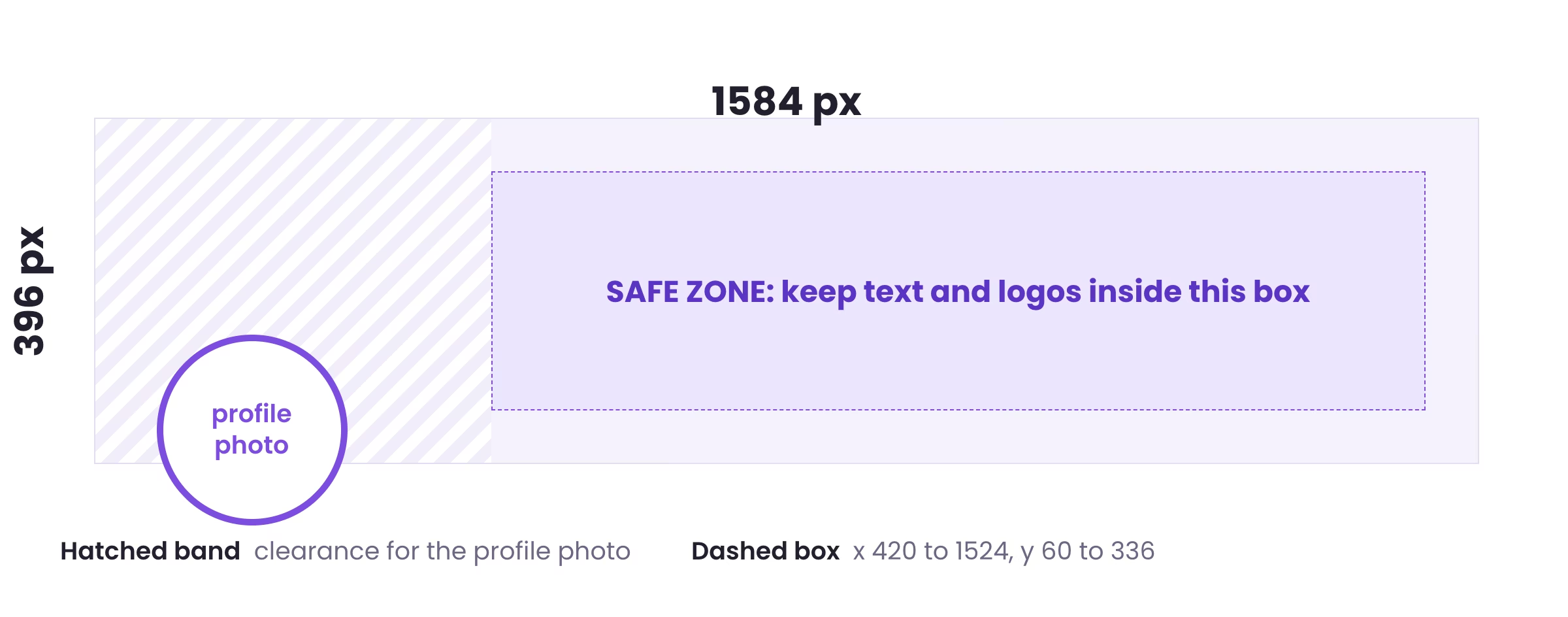
In practice that means composing right of center. Put the headline and any logo wall in the dashed area, let the left third carry background texture or color, and accept that the lower left corner belongs to your face. Designs that center a headline across the full width lose the first few words behind the avatar.
Why does a LinkedIn banner look blurry or cropped?
Blurry and cropped are two separate problems with two separate causes, and both are avoidable.
Blurriness comes from resolution. If the source file is smaller than 1584 x 396, LinkedIn scales it up and the detail is already gone before compression starts. LinkedIn then re-encodes every upload, which hits photographs, gradients and small text hardest. Export at exactly 1584 x 396, keep type large, and prefer flat color over subtle gradients that band under compression.
Cropping comes from geometry. The banner fills a container whose proportions shift with viewport width, so the browser trims whichever edge does not fit. A logo tucked into the top right corner on your laptop can vanish entirely on someone else's phone. The safe zone above is the fix.
How do you design a LinkedIn banner in 10 minutes?
Open any design tool, start a custom canvas at 1584 x 396, and work through the brief below. It is the same spec sheet we hand to a designer before a client profile goes live, so it covers the constraints that cause rework rather than the creative direction, which is yours.
CANVAS
  Personal profile   1584 x 396 px   (4:1)
  Company Page       1512 x 256 px   (5.9:1)
  Export             PNG, under 1 MB, no upscaling

SAFE ZONE  (personal profile)
  Horizontal   x 420  to  x 1524
  Vertical     y  60  to  y  336
  Lower left corner is covered by the profile photo. Leave it empty.

CONTENT  (pick four, not six)
  1  Promise    who you help, and the outcome. One line.
  2  Proof      logos, a number, an award, an "as featured in" strip.
  3  CTA        one next step: calendar link, DM keyword, or URL.
  4  Identity   your photo, a product shot, or one brand color.

TYPE
  Headline     60 px minimum on the 1584 canvas
  Body         32 px minimum
  Faces        two maximum, one of them for the headline only

CHECK BEFORE UPLOAD
  [ ] Reads at 25% zoom
  [ ] Nothing important in the outer 60 px on any edge
  [ ] Nothing important in the lower left corner
  [ ] Viewed on a phone, not only on the desktop preview
  [ ] Message matches the headline and About section
What do the best LinkedIn banners have in common?
After looking at thousands of LinkedIn banners (for clients, for ourselves, for the research that went into this article), a pattern shows up. The banners that drive replies, follows, and meetings share six things. The decorative ones miss three or more.
This is the rubric we use internally before any client banner goes live. Use it on yours.
Promise
Who you help and the outcome you deliver. One sentence, plain English.
Proof
Logos, awards, follower counts, revenue numbers, "as featured in" badges.
CTA
A specific next step. DM keyword, calendar link, URL, "book a call."
Personality
Color, photo of you, illustration, or visual metaphor that makes you not generic.
Hierarchy
One focal point. Max two fonts. The eye should know where to land first.
Photo offset
The bottom-left third stays empty. Composition flows around your photo, not into it.
A few quick notes on how to apply these in practice.
Promise isn't a slogan. "Marketing for the modern world" is a slogan. "I help B2B SaaS founders book 20+ demos a month" is a promise. Slogans are pretty. Promises convert.
Proof is anything borrowed. Logos of companies you've worked with, awards, "as featured in" badges, numbers, follower counts. If you have it, show it. Don't bury it in your About section where most visitors will never reach.
CTA is the weakest link in most banners. Even gorgeous designs skip it. Pick one specific next step. One, not three.
Personality is whatever stops the scroll. A bold color, a real photo of you, an illustration, a visual metaphor. Stock photos and generic gradients fail this test by definition.
Hierarchy means one focal point. If everything is the same size and weight, nothing stands out.
Photo offset is the technical one. Bottom-left third gets covered by your photo on desktop. Compose around it.
If your current banner is missing three or more of these, redesign. Six out of six is the gold standard.
Which LinkedIn banner examples are worth copying?
Let's take a look at what actually works. The right banner depends on what you're trying to get out of LinkedIn. A founder's banner has very different goals than a job seeker's, and a copywriter's banner has very different goals than a recruiter's. Below: 10+ real examples organized by role, with a breakdown of why each one works and when to copy the structure for your own profile.
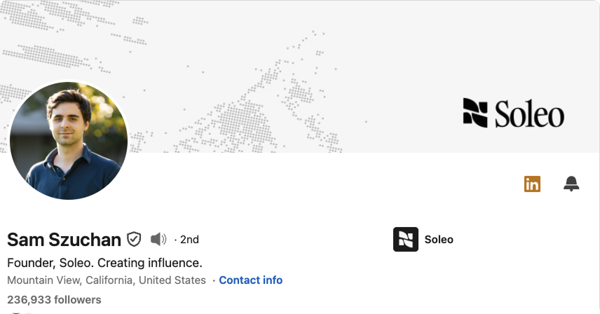
For founders & CEOs
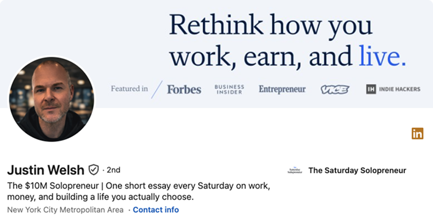
When a prospect, investor, candidate, or journalist looks you up, your banner is the first thing they see. It needs to communicate what your company does, who it's for, and why anyone should trust you, all in less than ten words.
Most founders also miss something else. Your personal LinkedIn profile is often a more-visited URL than your company website, especially early on. If your banner does nothing, you're leaving warm traffic on the table.

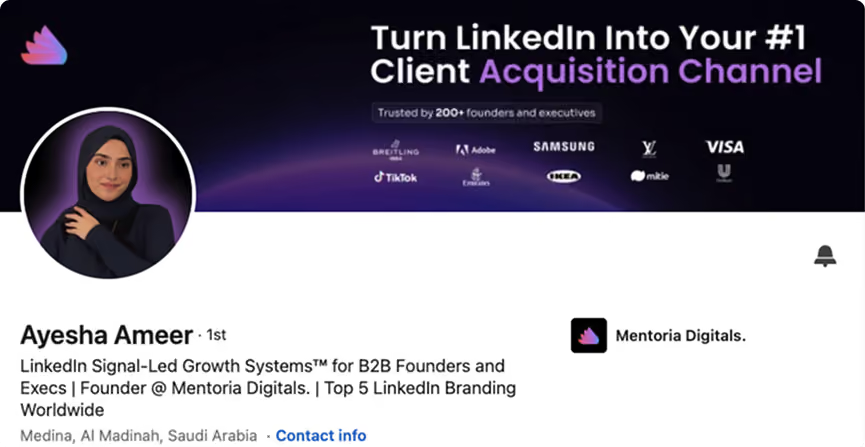
For consultants, agencies & service providers
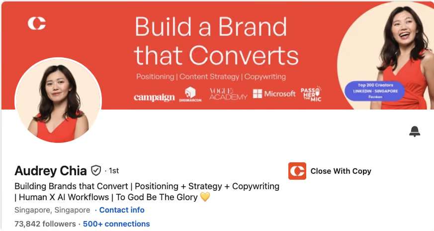
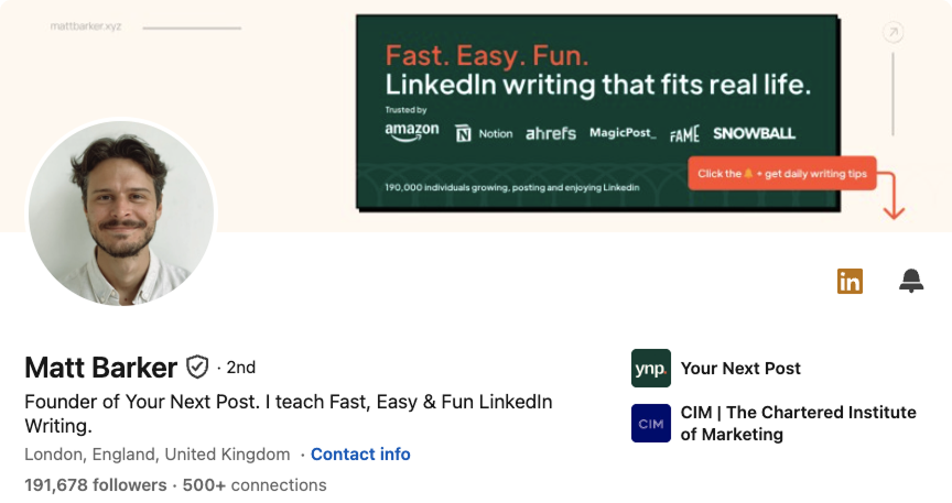
Consultants and agency operators have the most valuable banner real estate on LinkedIn. Your profile literally is your storefront. There's no separate "company brand" doing the selling. You, your headline, your About, and your banner are the brand.
A great consultant banner answers three questions at a glance. What do you do? Who is it for? How do I hire you?

For creators, marketers & writers
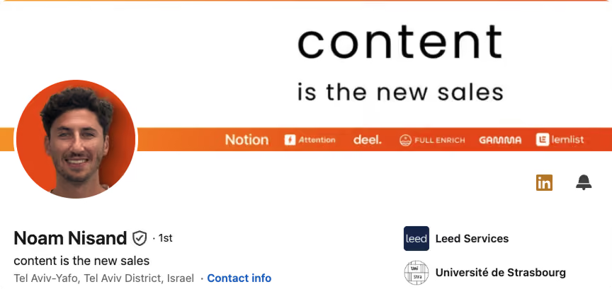
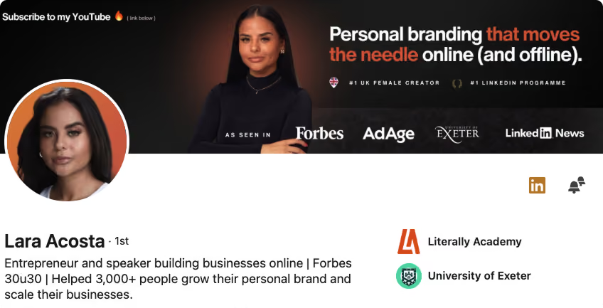
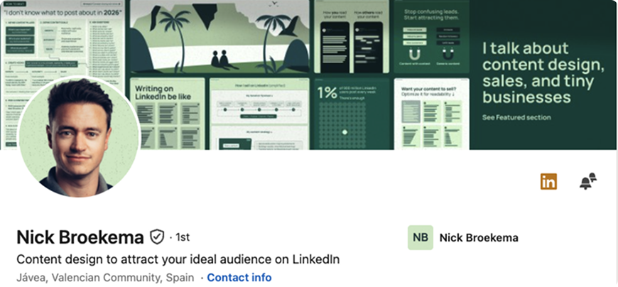
Creators on LinkedIn are competing for follows, not just leads. Which means the banner has to do double duty. It needs to signal what you write about (so the right people follow) and give visitors a fast reason to hit Follow (so they actually do).
Which banner style fits your role?
If none of the role-specific examples feel like a clean fit, no stress. Default to one of the eight style archetypes below. Each one solves a specific design problem: standing out in the feed, signaling trust, displaying proof, or adding humanity. Pick whichever pairs best with your industry and personality.
A quick note on combining styles. Most great banners aren't pure archetypes. Sahil's is "launch banner" plus "product mockup." Audrey's is "solid color + bold statement" plus "logo wall" plus "photo of you." Lara's stacks four styles cleanly. Pick a primary style, then layer one secondary element. Three styles stacked together is design noise.
What are the most common LinkedIn banner mistakes?
Most weak banners are not badly designed. They break one of these six rules, and each one takes under five minutes to fix.
| Mistake | What it looks like | The fix |
|---|---|---|
| Wrong dimensions | A stretched or letterboxed image with visible bars | Rebuild the canvas at 1584 x 396 rather than resizing an existing file |
| Upscaled source | Soft edges and mushy type, worst on the headline | Export from a document that was 1584 x 396 from the start |
| Content in the corners | A logo or CTA that disappears on mobile | Move everything inside x 420 to 1524 and y 60 to 336 |
| Hidden behind the avatar | The first two words of the headline are covered | Compose right of center and leave the lower left empty |
| Too many messages | Three offers, four logos, two CTAs, no focal point | Cut to one promise, one proof point, one call to action |
| Default or empty | The stock blue gradient LinkedIn assigns | Any deliberate banner outperforms the default, including plain brand color and a single line |
If your current banner breaks three or more of these, rebuild it rather than patching it. For where the banner sits in the wider profile, the LinkedIn prospecting guide covers the headline, About section and featured links that a visitor reads immediately after. A strong profile is also the front end of any outbound motion, which is what our LinkedIn ghostwriting service is built around.
A great banner gets the profile visit. The system books the meeting.
Reachly builds and runs signal-based outbound across cold email, LinkedIn, and cold calling, so the profile people land on is backed by a pipeline that actually fills. Retainers start at $3,500 a month.
See how LinkedIn ghostwriting works
Frequently asked questions about LinkedIn banner size
What is the LinkedIn banner size in 2026?
1584 x 396 pixels for a personal profile background photo, and 1512 x 256 pixels for a Company Page cover image. The profile banner takes a JPG or PNG up to 8 MB. Company Page images take a PNG or JPEG up to 3 MB. Both figures come from LinkedIn's own help documentation.
What are the LinkedIn banner dimensions in pixels?
1584 pixels wide by 396 pixels tall for a personal profile. Design at exactly that size rather than scaling up from something smaller, because LinkedIn re-compresses every upload and an upscaled file loses detail twice.
What is the LinkedIn banner aspect ratio?
The personal profile banner is 4:1. The Company Page cover is closer to 5.9:1, which is a much wider and shallower strip, so a design built for a personal profile will not transfer to a Page without a rework.
What size is a LinkedIn Company Page cover image?
1512 x 256 pixels, as both the minimum and the recommended size in LinkedIn's image specifications. The maximum file size is 3 MB and the accepted formats are PNG and JPEG.
Is the LinkedIn Company Page cover 1128 x 191 or 1512 x 256?
1512 x 256. The 1128 x 191 figure is an older spec that is still repeated across most size guides and even inside Google's AI Overview. LinkedIn's current help page lists 1512 x 256 as both the minimum and the recommended cover image size.
What is the LinkedIn banner safe zone?
The area of the 1584 x 396 canvas that stays visible and uncovered across devices. Reachly designs to a safe zone running from x 420 to x 1524 and y 60 to y 336, which clears the profile photo in the lower left corner and leaves margin at every edge for cropping.
Why is my LinkedIn banner blurry?
Almost always because the source file was smaller than 1584 x 396 and got scaled up on upload. LinkedIn also re-compresses images, so a photograph with fine detail or a gradient with subtle banding degrades more than flat color and large type. Export at full size and keep the design simple.
Why does LinkedIn crop my banner?
The banner fills a container whose proportions change with screen width, so the browser or app trims whichever edge does not fit. Anything close to the outer border can disappear. Keeping text and logos inside the safe zone is what prevents it.
What file type should a LinkedIn banner be?
JPG or PNG for a personal profile background photo. PNG or JPEG for every Company Page image. PNG holds up better for flat color, solid backgrounds, and text, which is what most effective banners are made of.
What is the maximum file size for a LinkedIn banner?
8 MB for a personal profile background photo and 3 MB for Company Page images. Neither is a target. A well built banner usually lands well under 1 MB, and a smaller file gives the compressor less to damage.
Does the LinkedIn banner look different on mobile and desktop?
Yes. The same file is served to both, but the visible slice differs because the container proportions differ, and the profile photo sits at a different position relative to the banner. Check the profile on a phone before deciding the banner is finished.
What size should a LinkedIn banner be in Canva?
Start a custom design at 1584 x 396 pixels. Canva's stock LinkedIn banner preset has historically used other dimensions, so setting the canvas manually is safer than trusting a template name.
Should I put a CTA on my LinkedIn banner?
Yes, on any profile where the goal is pipeline. One specific next step, such as a calendar link, a DM keyword, or a URL, converts profile views into conversations. Keep it inside the safe zone and align it with what the headline and About section promise.
How often should I update my LinkedIn banner?
Whenever the offer changes, and otherwise around every six months. A banner promoting a launch that shipped last year quietly tells every visitor that the profile is unattended.
Recommended service
LinkedIn Ghostwriting
Reachly writes and runs your LinkedIn presence so your profile builds authority and brings in inbound B2B leads.